Zara
Website Redesign
DESCRIPTION
This is a study of the possibility of a redesigned desktop website user interface of Zara.com. without proposing a completely tangent brand identity. This is just a concept and not done by ZARA.
.png)
DESCRIPTION
Zara redesign is a personal project I worked on for about a month. The main goal is to reframe and design a better website that align and fulfill what users are looking for by shopping online.
ROLE
Product Designer
YEAR
2021 November - December
TOOLS
Zoom, Google Jamboard, Photoshop, Figma
Having a bad website is just embarrassing...
When people joke about it, they will instead not shop at Zara if the website is the only option to shop at. That being said, that prompted me to take the time to investigate Zara’s current website and revamp it into a more user-friendly website that will help drive more site traffic and change the customer online shopping experience at Zara.com.
🧠 My Mission
Research and redesign a responsive website for Zara that is tailored to both first-time customers and recurring customers while keeping the brand aesthetic.
Challenge
While ZARA claims itself to be a customer-centric brand, users online have expressed difficulties and issues in the usability of ZARA’s site. Having a poor user experience drives people either to shop in person or not to make purchasing from ZARA at all.
With this happening, there is a possibility they are losing a lot of potential customers.
This prompted me to do research and redesign a responsive website for ZARA that is tailored to both first-time customers and recurring customers while keeping ZARA’s current branding.
First Stage — Research
📝 Research Plan
Research Synthesis
I conducted a usability test compliant with 5 users; through user surveys and interviews, I detected patterns in the user’s digital experience.
I also studied ZARA’s competitors by going through their websites and identifying upsides and downsides to ensure this new user interface does not repeat past mistakes and can enhance the site’s ease of use when searching for and purchasing clothing items.
Testing System:
Moderated (tasks) + unmoderated (SUS)
Location:
New York and Remote (video calls)
Date:
12-14 January
Participant:
5 Fashion conscience users aging between 18-35 years old, who enjoy shopping online or in person.
Usability Testing
The following steps make up the procedure for the usability testing:
1. Recruiting Participants
2. Obtaining Participant Information Screening Participants
3. Setting up Meeting Time
4. Sending Preparatory Test Materials
5. Conducting the Usability Test
6. Post-Test Interview
7. Post-Test Questionnaire
💡 Here are a few tasks that I included in all the interactions with interviewees :
-
Try to add any clothing to your bag
-
After adding 2 items to your bag, try to remove one
-
Navigate to the category list
-
Log out of the app and log in again
Analyzing the responses received,
1/5 participants believe Zara’s current website is easy to use.
3/5 participants end up deciding to shop somewhere else or ZARA’s brick-and-mortar store because the website is confusing.
4/5 participants were aware that Zara has a mobile app.
❓ Problem Statement
Obviously, there are 2 significant problems on ZARA’s website, and our goal is to fix and upgrade them.

Visibility of System Status
The website caused users to feel overwhelmed, I studied the website from two perspectives: zoomed out to observe its overall grid layout and zoomed to 100%, how users see it.
User Control and Freedom
Some areas were hard to navigate or would cause frustration, these issues are present in the “Search” function and when the user empties his or her cart. Also, there is no back button available.

Second Stage — Define
📈 Competitive Analysis
Going through ZARA’s biggest competitors, Uniqlo, H&M, ASOS, and Mango, ZARA is trying to separate itself from other fast-fashion retailers by the concept they represent. ZARA took Yves Saint Laurent and Tom Ford as their aspirational brand, therefore, their styling and design are very similar to luxury brands. To align with their brand’s mission, ZARA’s user interface should look like a top luxury designer brand website.

The product page is clean and informative, steps of finding size and color are easy and quick.
Categories and filters both offered a wide range of selections.
Consistency of images and simple navigations make the shopping experience simple.
With that being said, my goal in redesigning the ZARA Website was to focus on two main tasks.
💡 Ideation
1. Minimizing the aesthetics of the navigation bar to improve navigation.
2. Improving the user interface of their product pages without compromising their integrity.
Efficiency of Use
Cohesive Minimalist Design
Third Stage — Ideate
Mid Fidelity Wireframes
After gathering all ideas and information, I sketched the Low-Fidelity Wireframes on paper. I then moved on to designing these Mid-Fidelity Wireframes using Figma.

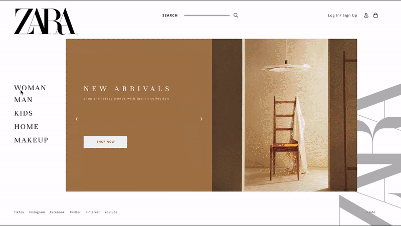
Home

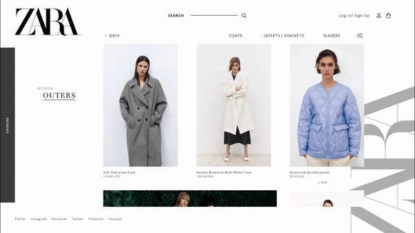
Category Page

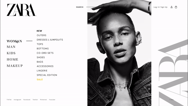
Menu

Product Page
Fourth Stage — Testing
📬 Testing and Insights
After the first wireframe design was complete, I tested the prototype with 5 representative users to see how user-friendly the website is, also if it has solved the problems current users were facing. The test was conducted over video calls and in-person interviews, where they were given the following tasks while I observed how they navigated through the application.
Tasks
-
Find specific products under the coat category.
-
Add and change the quantity in the cart.
-
Successfully checkout and navigate back to Home.
The users had great feedback about how it is so much easier to shop around with this design, the design and simple, fresh yet kept the image modern and high quality, also easy on the eye. Especially the success rate for completing the task was 100% after the redesign.
Some feedback from the users:
" The interface looks much cleaner and it is easier for me to look for a specific product!"
" Oh wow, this is definitely so much better, the only thing I would probably add on would be I want to see some reviews. "
" Might be great if the item information can be shown without clicking?"
" I would actually like the sizing chart listing down below, but I understand the aesthetic of being minimal and clean, so I guess it should be fine. "
Fifth Stage — Prototype

Home
Menu > Product
Menu
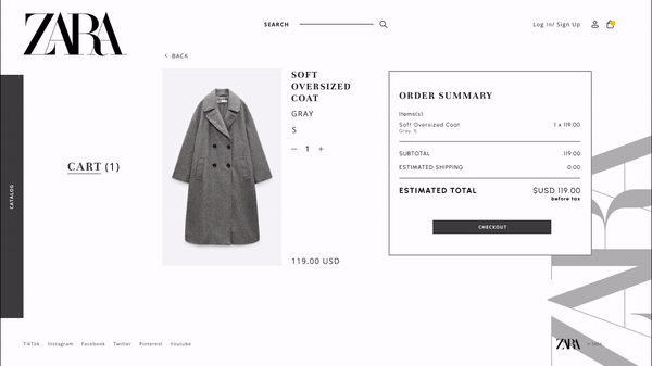
Checkout
Final Stage — Key Takeaways
👀 What I Learned
As a consumer of ZARA, I do enjoy its products. However, through my own experiences and the data collected from consumers, ZARA needs a new user interface. The results from this usability testing of ZARA’s website produced eye-opening results that answered the research goals.
Overall, this personal project was a fun way to experiment with balancing aesthetics with usability. While I wanted to keep the unique, exciting appearance of the ZARA website, I explored ways to make the experience more enjoyable and convenient for users. Had I had more time, next time, I would have used a larger user test group and experimented with micro-animations throughout the site.
🧗 Future Concepts
Customer Review
Sizing Chart and Product Care Page